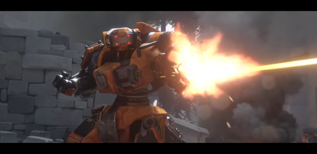
To add to my use of color palettes, i would look into the overwatch shorts as to get an idea of how the tones and highlights create atmosphere and an attempt to create and convey emotion, for example: a front lit, back lit,
The former would allow to create a more fully realised mech, creating a more friendly look, whereas backlit creates a more menacing
https://youtu.be/kKVf5feSMEg- borderlands 2 doomsday trailer
The feeling omitted from the trailers suggest a very chaotic, goofy and lighthearted feeling that i wpuld like to replicate within my own work, creating a lighthearted and easy going feeling, but with sinister undertones, though not too excessively gorey, distrubing or anything of the matter, just enough to give off a feeling that some of the creatures, mechs and bosses are a lot more sinister then others
As well as borderlands, another good use of lighting and color palettes would be reinhardts short from overwatch, which, in my honest opinion, is a masterpiece of a short made by blizzard entertainment. A masterpiece in of itself but what i want to focus on is how the lighting dramatically plays a part in how it masterfully shows us whats happening without us being told as such
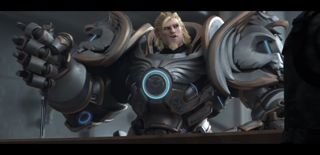

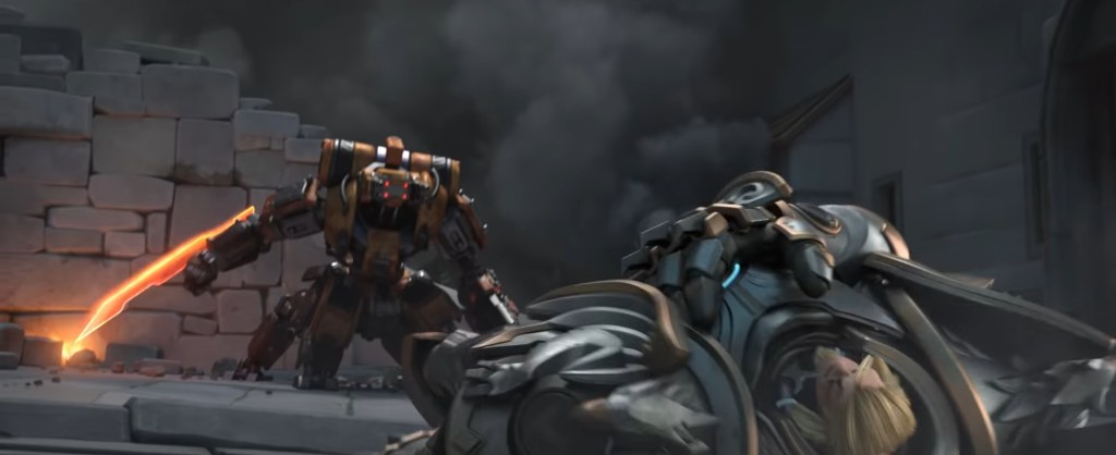
Lighting in of itself plays such a vital roll within the short as it quickly allows the audience to understand who is what and their intentions without all the extra nonsense, keeping things relatively simple, not having to explain to much and just allowing the audience to get a good understanding for themselves rather then being told otherwise
This is what i would like to convey within my own work with lighting when i draw and concept my main focus, which will be the mechs, conveying the feeling and aesthetics of each of them clearly.
In conclusion, i feel that understanding lighting and color will help to dramatically lift my games feelings and emotional capability with ease if i am to take in the use of lighting when dealing with the creation of the designs
