as of the last few weeks i and my teammate Laura have been working on the conceptualistion of a partial story for the game mech a mech, she had come up with a few names that had really struck me and made the world feel a bit more alive then what i could do alone, she had created three different names to use for the world which were, azoicus, syminerun and oretaurus, each one of them with an exceptional amount of punch and a equal amount of splendor and grit which make them sound mean and rather uninhabitable.
though i had not been thinking of a name for the world as of yet, creating a name had made things a lot easier alongside working and creating what would be in store for the player and what enemies they would face
some of the description that i had given to Laura was such as this :
imagine a world that has no set biome in specific area, how a world would usually get hotter at the equator and colder at the poles, the world is like a misshapen rubix cube, with all of the known earthly biomes scattered and contained within thousands of acres of land, instantly changing from arid deserts to humid jungles, from frozen wastelands to large open grasslands all neatly hudddled up next to one another and equally thriving all the same wwith no repercussions
maybe paraphrased because trying to come up with ideas off the top of my head is hard
we had decided that the world would also b completely uninahabited and would be only monsters, on this world, as of such, i have decided to remove the excator unit bot enemy from the game as it would not make sense contextually with thee game itself
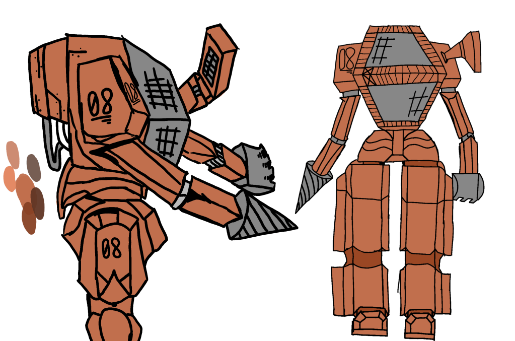
although there will be other mechanical based monsters in the game the others that the player will be fighting will be sentient and somehow described within the game that they are not being controlled unlike the mech suits that are used by the players to complete the goal set before them
in the meantime i am also developing other necessary parts to my game such as icons for both mech and monsters alike and will need to annotate them correctly acoording to what i would like each corrosponding icon to represent and do
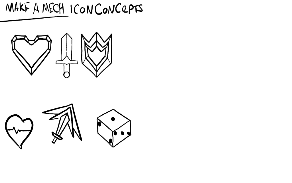
I will give them colour eventually, although i had other icons in mind, they did not necessarily click with me and feel they made the right impact for in terms of what they did, i will eventually clean up and etail themm a little bit more in the future adding olor and shading, highlights and all that other fun stuff in the near future.
as of the last few days aswell i have been thinking about my archetypes and how to implement them effectively in the game, my initial thought was to have them as just words as a simple design choice ut i feel that lacks a certain substance and creativity
though i have not tried it out as of yet, i may add this alongside my other attempts of icon design to see how they would fair, then, creating a digital version of the card with all of the necessary info on them, such as icons, archetypes and maybe an attempt at a mechanic as well, but we will cross that bridge in due time
alongside this and usual standard procedures so far, i have created a few variants of hero images which woudl be the initial title screen and box art for my game, made by me and with the help of my teammate who has been a major help throughout all of this, Laura

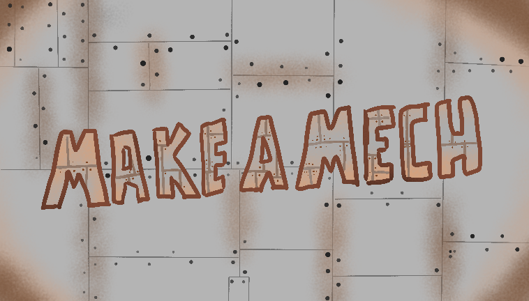
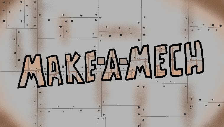
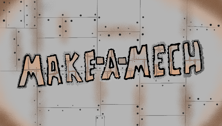
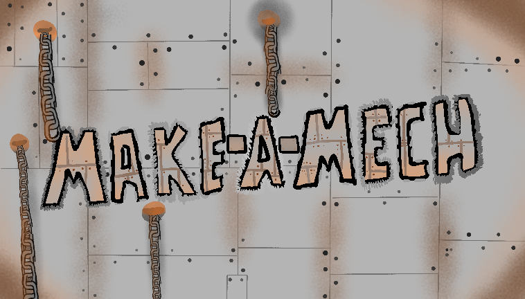
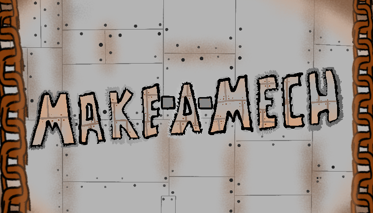
i will be making small tweaks to the last logo, moving the left chin slightly further away from the lettering to give it a bit more room to breathe, but as of the moment i feel quietly confident about this logo and how it will look compared to the rest of the game later down the line.
